By Debbie Gillum
News Editor
A new president, a new food provider, a new cardio room, the CarShare program, and of course, a new website – that is all it takes to amaze students, faculty, staff, alumni and parents alike.
While still in the very early stages, the new website has already had positive anecdotal comments by key influencers.
“So far, prospective students, guidance counselors, and donors really like the website. The hope is that MyDenison becomes the internal portal and the Denison.edu website becomes the external portal,” said President Adam Weinberg.
The website serves a wide variety of audiences, but a main focus is in recruiting prospective students.
“The new website will help raise visibility. We are always concerned about admissions, so we hope the website will become a sort of funnel to encourage new students to visit our campus,” Weinberg said.
Jesse Yeager ’10, assistant director of Admissions, who just returned from a “Southwest” tour of the Colleges That Change Lives fair in Chicago, Denver, Albuquerque and Phoenix, said that the new website attracted students to learn more about Denison. “I had multiple students comment to me that Denison had the best website of any of the (40 or so) Colleges That Change Lives schools,” said Yeager.
Yeager said she liked how the new website is very externally oriented, “It is a place I want to send students to so they can truly explore our college more and learn about the wonderful people here and the fascinating projects and passions that they pursue!”
The site is primarily for people who don’t know Denison, but is still useful for staff and students.
“The site is designed to help outsiders and newcomers get to know Denison better and provide a big picture overview of who we are,” said Scott Tribble, director of he Office of Digital Strategy & Development. Tribble was the guiding force throughout the long process of getting a new website.
“It was his vision and guidance that enabled us to produce a site that goes well beyond the countless standard-issue ‘.edu’ sites that so many colleges are publishing these days,” said Jack Hire, director of University Communications.
Though the initiative was a team effort by the Office of Web, Social and Mobile Strategy & Development, and the University Communications staff, Tribble was charged with managing the project from concept to launch. This included defining the mission and scope of the site, developing its technical specifications, and identifying its organization, form and functionality.
“Because of the breadth, depth and richness of this dynamic site, it was an enormous undertaking, but with its launch in mid-August, Denison was able to take a quantum leap into a new era of communications with its public audiences.” said Hire.
“It’s often challenging to help people understand how vibrant the Denison community is and how engaged and friendly students are,” said Weinberg. “The more we can tell stories about our students, the more it helps people understand the texture of our community,” emphasizing that Denison’s major “selling point” is its quality of students, faculty and staff.
The previous website, last revamped in 2007, was viewed as static, whereas the new website helps keep Denison up with the times.
Getting to the new website was far from a quick and easy experience, especially because it was built up from scratch.
First, it was agreed upon by the college that Denison needed a modern web communication platform that could connect with prospective and current students, as well as faculty and staff.
“We wanted the website to communicate to these audiences in a way that they are accustomed to being communicated to online,” said Tribble. He emphasized how it is “important for Denison to be aligned with the times and modern communications.”
Next, the right web partner had to be found. This search started in the early summer of 2011. Code and Theory, the partner that Denison ultimately chose to help them with the programming, code and design, has previously worked with Vogue and The Daily Beast.
When thinking about a new website design, Tribble looked to websites like Mashable, CNN and ESPN for inspiration. He wanted to explore what non-education organizations were doing on their websites.
“In the .edu space, there is a lot of similarity out there. We wanted something different,” Tribble said.
The new website was a lengthy process because the new site was built from scratch and it was time consuming to move content from the old website to the new website, according to Tribble.
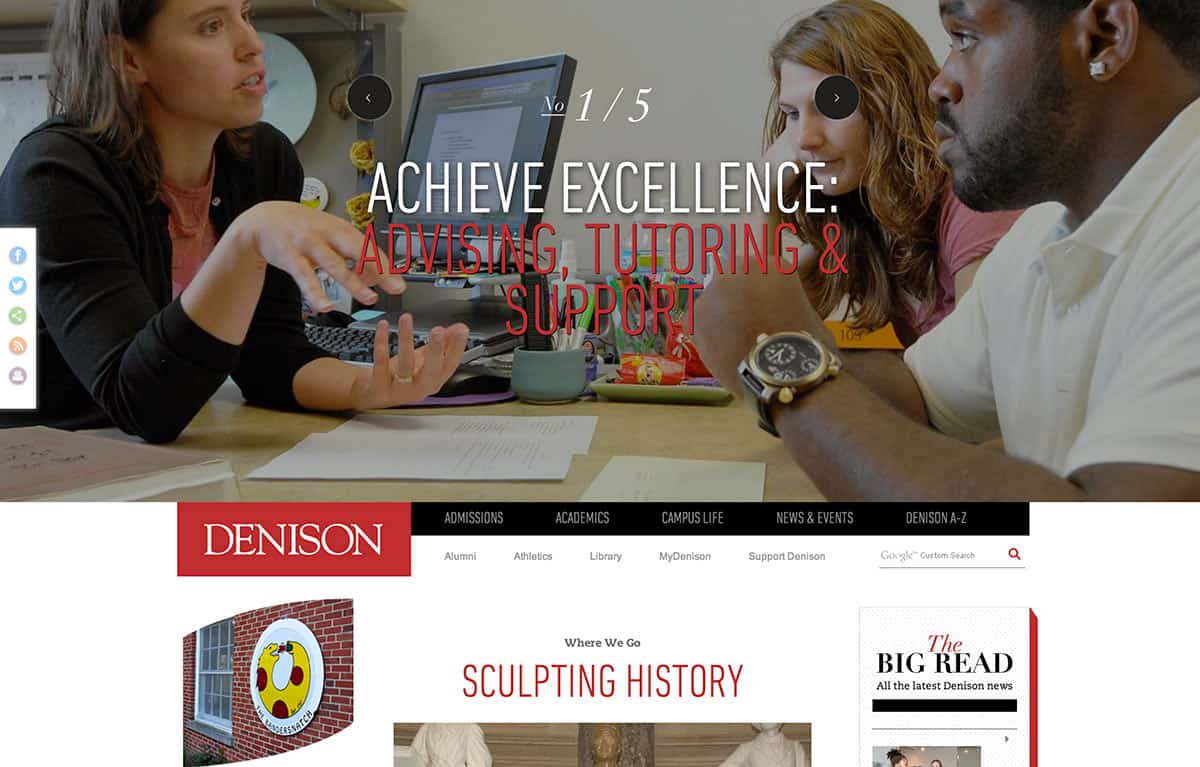
In the end, the new layout of the website is, “striking, elegant and has beautiful typography” according to Tribble, “It’s bold for a college website but still feels appropriate.”
The new site is more conceptually organized around topics and related areas of interest, whereas the old website was based on the university’s organizational chart.
Three new features of the website are the “Straight Talk From Students”, “Get to Know Denison” and “Denison A to Z”. The “Straight Talk From Students” is from-the-heart unedited student comments and advice. The “Denison A to Z” guide is a dynamic directory which is a literal and figurative A to Z guide of everything you need to know.
The “Get to Know Denison” section gives people a virtual campus experience of not only the exterior of buildings but also highlights what happens inside those buildings. This is a great tool for students who live outside of America and might not be able to visit Denison before applying.
The key motto behind the new website’s design is the tried-and-true phrase “show, don’t tell.” Tribble wanted it to be more visual. “Images can be very powerful,” said Tribble, “It was a conscious decision to make the site much more visual.” Online, www.wenison.edu will continue to grow over the next several years. Websites are built to be continually adapted, according to Tribble.
Tribble himself said it best: “The day you launch a website, it is already out of date.”

